http://prezi.com/h7tib81sprhz/untitled-prezi/?kw=view-h7tib81sprhz&rc=ref-40672995
My media product's title is 'Listen'. This is a relatable masthead because it links with 'listen to music' so it promotes the idea of 'Listen to my magazine'. The title font and style for the magazine front cover is similar to the contents page title too. They are both a medium-dark blue as it is cool colour that isn't too bright and tacky but is still bold. The letters are joined together to support to idea of flowing music and sounds. The font is easy to read but not too plain that it seems boring.
I have used a range of mise-en-scene of the images used such as the camera shots. I have used a mid-shot for the front cover image, a close-up and a long-shot for the contents page. In the contents page I have used an over the shoulder shot, wide shot and a low angle shot. The mise-en-scene is the images through clothing link with what she is promoting in the double page spread, she is wearing ordinary clothes that aren't glossy or stagey because she talking about her new 'organic album'. I have used mise-en-scene through props such as the sofa and the cat to furthur link with her representation and dialogue in the double page spread. I have used mise-en-scene is the image of 'Labyrinth' through the glasses and the smart clothes he is wearing to show his smart and sophisticated facade he is represented as to the audience.I have used two people in my shots, all but one are of 'Katy Berry' whom the double page spread and front cover are all featured on. On the contents page there is another image of her and then one of another person, who is posing as 'Labyrinth'. These images show the artists representation and image from the mise-en-scene I explained above.
The written content is a question and answer process between the interviewer and 'Katy Berry'. they are asking about her album, the songs on there, the relase of it and also the influences for it and what has gone on behind the scenes whilst she has been making it.The music genre is presented through the artists, colours, fonts and text. Artists such as 'Rihanna', 'Chris Brown', 'Nicki Minaj', 'Alicia Neys' have all been mentioned from items like a new single, tour dates, interviews and new albums. These artists have been shown through the front cover and the contents page in which the colours have been made to appeal to the audience such as Pink, Blue, Purple Red and Black. I have not made the colours too bright as it would have made the magazine look unprofessional and tacky. They're slightly toned down but still look happy and fun.The fonts range depend on the artist but they are fun and jolly-looking to maintain the happy feel to the magazine and it links with the music that those artists make.The layout of the magazine is compact to fit a lot in, in terms of promotion, images and text but it isn't too crowded that it is difficult to read or looks messy and disorganised.


My media product presents particular social groups through many conventions amd aspects in the magazine; the artists focused on the magazine are applicable to young male and female readers. The artists are mostly Pop and R'n'B so is aimed at social groups with those tastes. The colours used are regular and consistent blue, pink, purple and red which are fairly balanced is gender stereotypes and also fit the representation of the artists spoken about. The fonts I have used are particular for the artist thst the text is about, so when reading, the look of the words supports the artists representation and image. The themes I have used also apply to the audience, as a young audience, there is information about the artists through an interview, upcoming album and single releases, artists returning to make music etc. Also, to grab the right audience there are two competitons that apply to the correct social group; Maroon 5 gig tickets (something young people love to go to and as a group), and also an Audi A4 competition (an extravagant car that a young male or female would usually not be able to afford)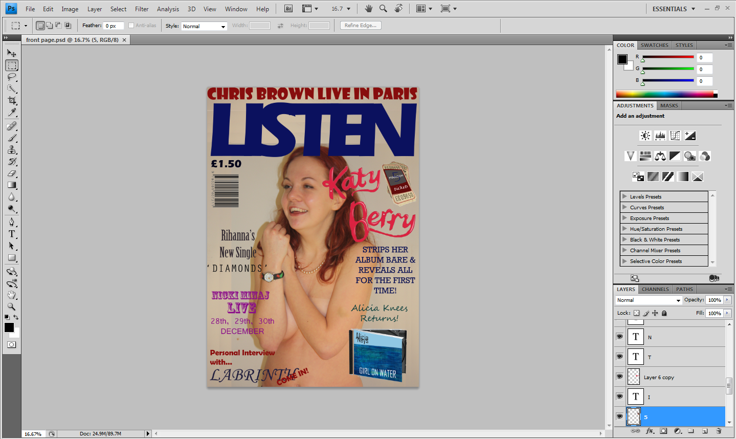


There may be other social groups that my magazine appeals such as a younger audience, with a music taste majorly based on Pop music. They may see the 'Katy Berry' cover and be attracted because of that artist. It may also also appeal to Hip-Hop fans as they are some artists features like Chris Brown, Jay-Z who may be of interest to that social group.

The kind of media institution that may distribute my magazine may be IPC Media. This is the institution that distributes the NME magazine and though slightly darker music tastes focused, it is a similar magazine in the themes and content. You would be able to buy this magazine in typical megazine stores such WHSmith, Nisa Locals, Londis stores, and also in supermarkets such as Sainsburys, Asda, Morrisons, Tesco etc. It could also be available in convienience stores.

My audience, very generalised, will be 16-24 year-old males and females who are very urban-driven and like being in the city and the 'buzz'. They are people who like socialising, partying, drinking, and probably wear 'snapbacks'. This audience will have a socio-economic class of C2, D, E. It is a fairly cheap magazine at £1.50 so it is affordable for students also. I have attracted the audience in my magazine through a edgy image of a pop-star on the front cover. The provocative image of 'Katy Berry' on the front cover will attract attention from my audience because it is an artist they would usually be seeing in big, brightly coloured dresses is now half-naked on a magzine cover - this is promote her new 'organic' and 'raw' new music, carrying the same theme from her music to her attire. I have also attracted the audience through other artist's names in bright, bold letters on the front cover so they know who they're going to be reading about and given it will be artists they like, they will then buy it and read it.
I have, while making this product, learnt that Photoshop (to get a quality outcome) is very complicated to use and required me to look at several YouTube tutorials to know my way around. Some aspects of Photoshop only require a little common sense and are easy to get around, but press the wrong button and your work could suddenly look like a jumble sale and all the images and texts are thrown off their places and mixed up. But once you get the basics, you can slowly gather what the more advanced things to and make your work a better quality. I am pleased with the outcome as I feel I ended being quite confident with the programme. I feel like I have learnt alot of things in the process of making this magazine as I have developed skills in different areas. Before this project, I had never used Blogger.com before and now I think I can work around the site fairly successfully. I had only played with Photoshop a little before this project doing slight changes like scaling, cutting etc. but now I have used some much more advanced tools to create what I have as an outcome now.


Through beginning to use photoshop when I first started creating my preliminary task, my skills have greatly improved. When I was making the prelimiary front cover, I didn't know how to adjust font and make the text how I wanted it to be - I could move it around and resize it but changing the colour and style was out of my skillset. Also, I had trouble dealing with the image I used, as when I tried placing it and re-sizing it, the proportions would distort and it looked awful. eventually, I got the hang of how I wanted it to look but I couldn't give it the effect I wanted it to. On the contents page, I began to think about compositoons I could use and I had drawn-up some good ones but I could not get them to look the same on Photoshop as they were too complex for what I could do. Over the course of then creating the final product, I was able to prject my original ideas for compositions and aesthetics just as effectively as they were in my mind, if not better!
No comments:
Post a Comment